I really enjoy the feedback process of design, and I got some nice and thoughtful feedback from my peers on my Serenity Park campaign! I truly do love to photograph and talk about nature, so this project was very satisfying to create. I hoped the brand and tranquility theme would resonate well and across the pieces of collateral and, based on the feedback, it seems to have done so.
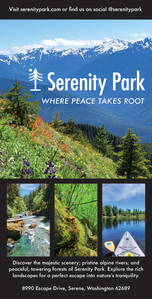
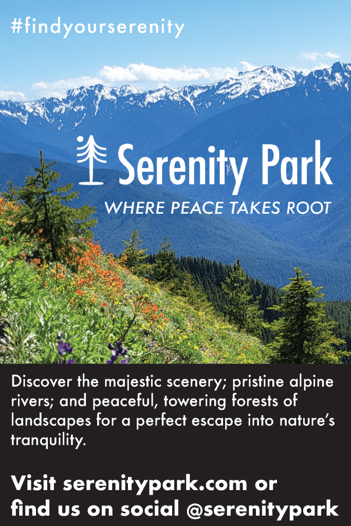
The first step of creating the marketing campaign was to define the concept and purpose of Serenity Park. I wanted to create a brand that conveyed a peaceful, natural escape for people to enjoy with various activities and landscapes. I created the name, logo, and tagline to encourage this concept. The logo needed to visually represent peace and nature, so using Adobe Illustrator, I designed the logo to include a tree and moon, both symbols of calm and natural beauty. I used the line and curvature tools to create a simple yet effective depiction of a pine tree. I made the moon with the ellipse tool and brought the two together. I made a black and white version of the logo with transparent backgrounds to accommodate the spacing and contrast needs of the pieces.
To bring the concept to life visually, I needed photography that evoked awe, inspiration, curiosity, and ultimately, desire for the park. I shot in Olympic National Park, Tolmie State Park, and Millersylvania State Park. Once I had my photographs I selected the best ones for variety, consistency, and clarity. Choosing the main image was the hardest part of selecting an image because it carries the entire campaign forward with the other images supporting.
For the typography, I wanted it to match the park’s theme of serenity while remaining clear and impactful. I established a hierarchy of text using the Futura font family, applying different styles (condensed medium for the logo, medium italic for the tagline, and bold for headings) to create visual distinction.
In designed the poster, brochure, print ad, and social media posts, I paid careful attention to scaling images and maintaining a clean layout that would guide the audience’s eyes toward the focal points—logo, tagline, and visuals—while balancing aesthetic and functional aspects. For the print ad, readability was prioritized, especially for older audiences who gravitate towards print more than younger folks. I used a clean layout with limited text to ensure the focus was on the descriptive blurb, call to action, and hashtag. For the Facebook and Instagram ads, I focused on the visual impact of the main photograph to capture attention, with minimal copy to drive engagement and clicking through to learn more. I designed the billboard to emphasize the call to action, using the bold style of the Futura font to ensure legibility for passing drivers. I designed each piece with its audience and context in mind, using large, readable fonts for print or using a striking visual focus for the social media pieces.
The first piece of feedback I received was for the poster: to add more descriptive text and try something other than the black background, perhaps making the background image opaque to feature the text box. To address this, I added the location address to the bottom of the poster. While there, I center aligned the descriptive blurb and found this looked better to my eye. Another piece of feedback I received was to diversify the photography a bit more. I liked this idea, so I also swapped out a picture of the trees on the poster with the photograph of the paddle board to mix up the different areas of the park being featured. I do think it makes the collateral a bit more dynamic to include varied photography. However, I did try a few different background styles, including making the background photograph gradually opaque to feature the text box, but ultimately, I think the black works best for clarity and contrast, which is important for a quickly read poster.
I was also advised to diversify the text weights and sizes a bit more. Visual hierarchy and variety of typography is so important for a marketing campaign to be effective. The only piece that I think that could benefit from this would be the on the print ad. So, I played around with the descriptive blurb and call to action text to try to get more differentiation and visual hierarchy. I landed on changing the blurb and call to action from Futura, Medium Italic to Futura Medium and then changed the descriptive blurb to Futura Bold. I think this achieved the effect.
Throughout the design process, from draft to final, I tried my best to emphasize consistency in messaging, a strong visual connection to nature, as well as visual impact, flow, and appropriate hierarchy throughout the pieces. I hope that, like the park, the marketing campaign gives one a sense of the simplicity of nature and the desire to take action towards that peace. It was really cool to be able to model my park from the gorgeous parks I visited to shoot the photography. I feel very fortunate to live in this visually stunning and peaceful region of the world that inspired Serenity Park.