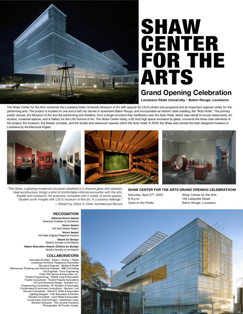

This week, we got to revise the print and digital pieces from our last posts based on peer feedback and further thoughts. First, let’s recap how I designed the pieces initially. I began the poster design by adding guidelines along the vertical and horizontal axes to apply the rule of thirds. I selected the images I thought had the most impact to feature at the top and bottom of the poster. I selected three other images that gave more insight and detail of the interior of the space to feature in the middle of the poster. I arranged the images this way to create balance and guide the viewer’s eye through the information. For both the poster and social media ads, I used Helvetica Neue, adjusting its weight and size to establish a clear hierarchy from the most important details to the least. I also ensured the font’s horizontal scale fit my desired spacing, creating a clean, bold look for the headings and easy-to-read styles for body text. I experimented extensively with font horizontal scale, font leading point, paragraph spacing before and after, as well as the alignment of the text boxes with the images until the layout felt visually appealing and impactful, while maintaining a focus on alignment, hierarchy, and limiting negative space.
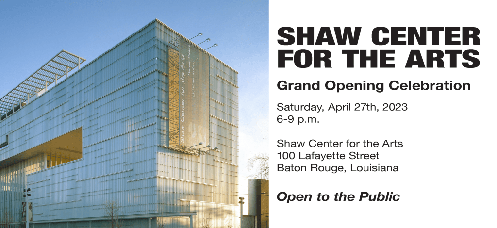
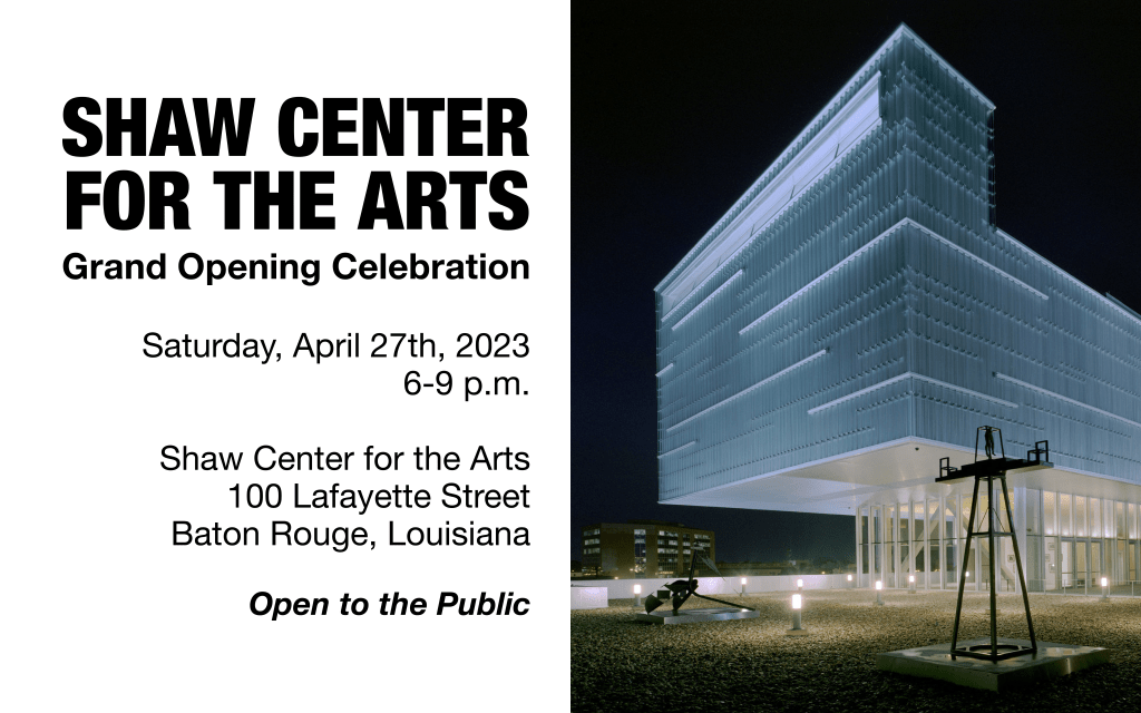
For the social media ads and print invite, I limited the design to one main image to ensure the important information stood out in the smaller spaces without complicating the main visuals of the design. For the Facebook ad, I included the event details, as I’ve found that Facebook’s older demographic prefers more information, opposed to Instagram users who tend to click through or follow links for additional details.
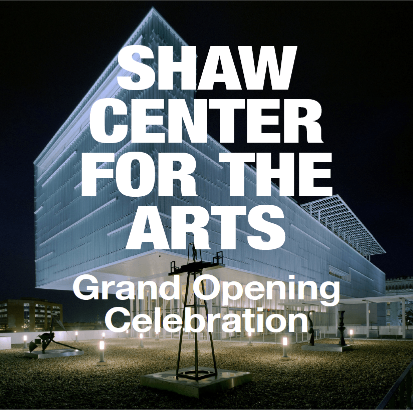
I got some very nice and helpful feedback on my designs! Some feedback said my designs demonstrated a strong use of visual hierarchy and consistency, making it easy for viewers to navigate. It seems my font choices were effective, allowing variation between elements like bold and italics, particularly on the text-heavy poster. The bold white text on my Instagram post made the design pop and it was suggested to apply a similar technique to the poster, however, I have not done that as I would need to drastically re-scale and rearrange the posters elements to accommodate this feedback.
There were other areas for improvement noted in my feedback: creating more white space between the main photo and text, addressing the cramped feel, and adjusting the scale of the text to avoid overpowering the image on Facebook ad. There was also a suggestion to experiment with more varied imagery and design elements between the social media posts. I tried a few versions of the Facebook post with other images and decided to swap out the main image I first used for the other main image from the poster. Both images holistically show the arts center from an external view, so I find them more appropriate for overarching visuals than the images featured internal glimpses of the arts center. I didn’t want to add any more elements to the Facebook or Instagram ads to keep the attention of the scrolling audiences.
In adjusting my designs using the feedback, I started with the poster. I created more white space between the main photo and the title. While doing this, I realized the event details, which repeats the opening title of the poster, was situated too closely to the event title, so I swapped the immediate elements from above and below the central three images, which put the event details and quote further down the page. This prompted extensive scaling and font style tweaking within the event details and quote to create even more visual symmetry and alignment. Another feedback point I incorporated was to reduce the text size of the Facebook ad, so the picture doesn’t get overwhelmed. As I was doing this, I also noticed how the print invitation could use a little more space between the picture and text for visual ease and so I moved those text boxes to add in the space. I figured out how to hide the frame edges in InDesign to be able to visualize how the elements in the pieces interacted more clearly. This was a game changer for bringing the pieces to their final result!
Overall, I think the poster, print invitation, and Facebook ad look much more balanced now and easier to read. I found the InDesign options of showing and hiding the frame edges and guides to be really helpful in making sure the overall designs were spaced and balanced well. Please see the final pieces below. I’m excited to use what I’ve learned moving forward as I improve my InDesign skills!
